Album Packaging Design

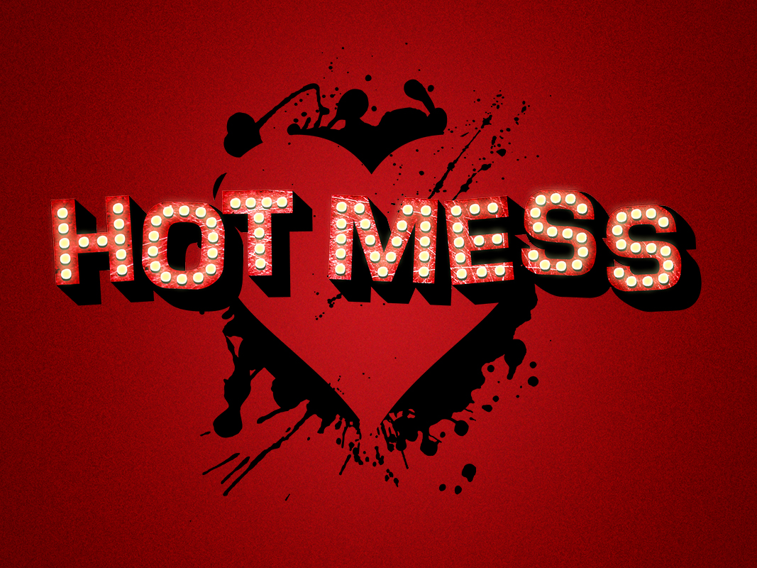
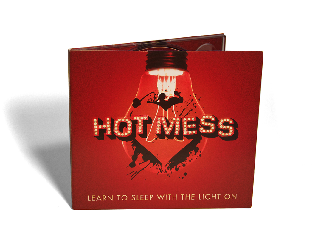
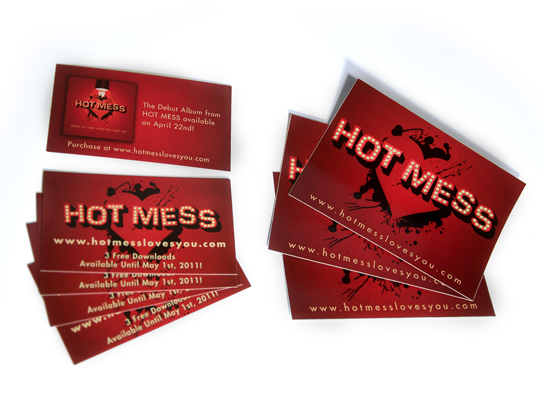
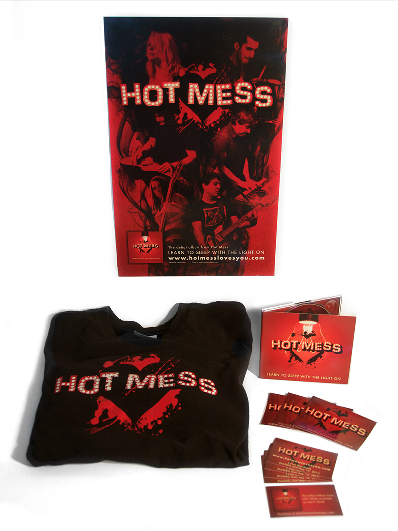
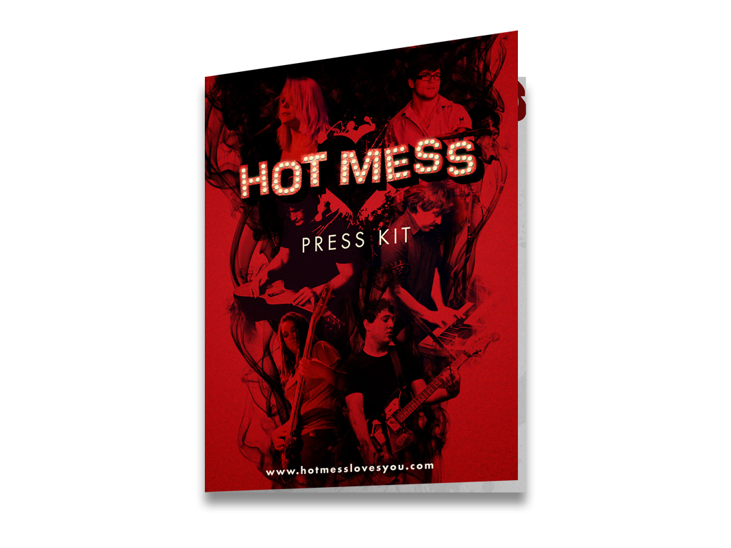
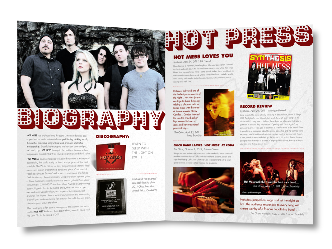
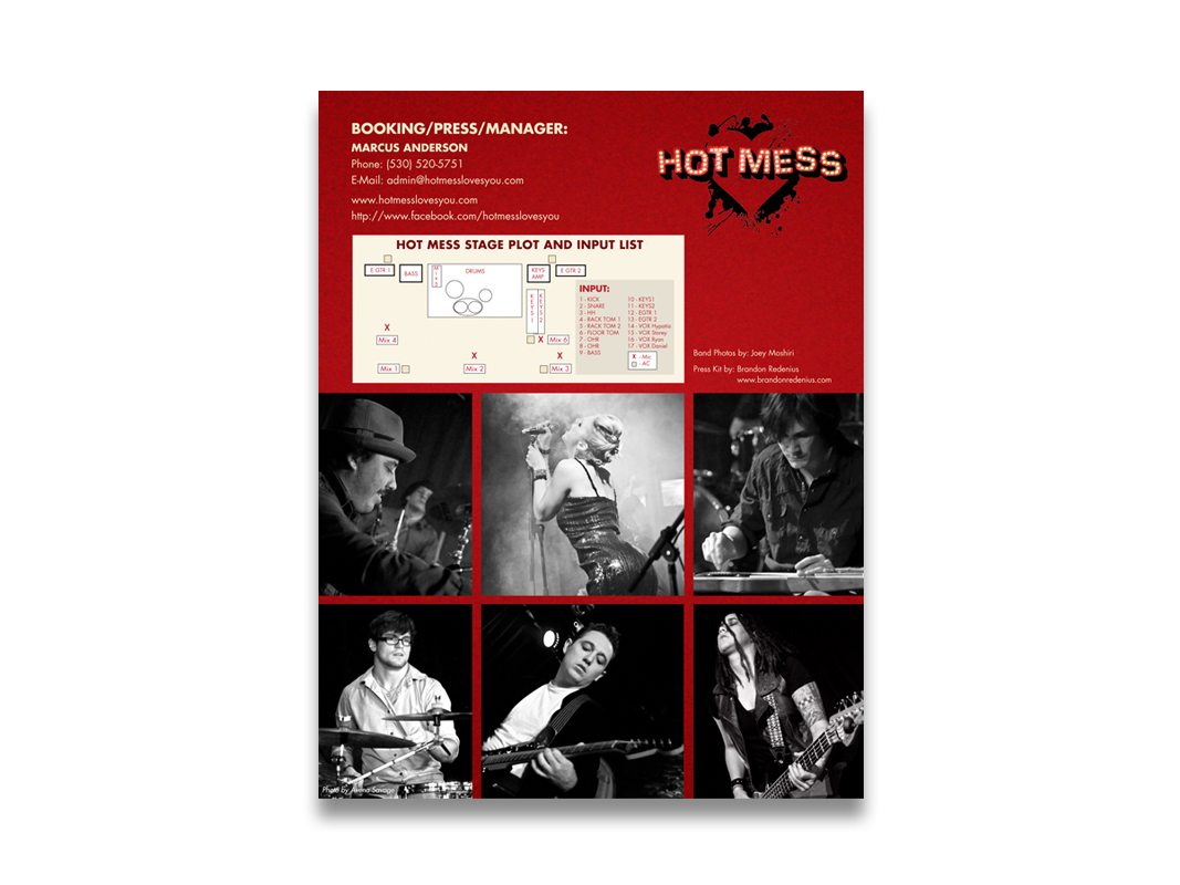
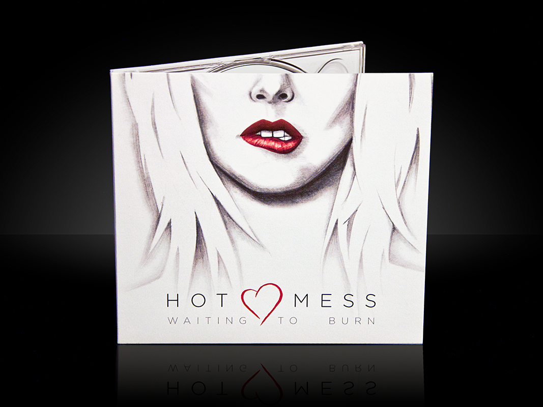
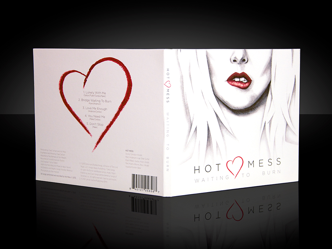
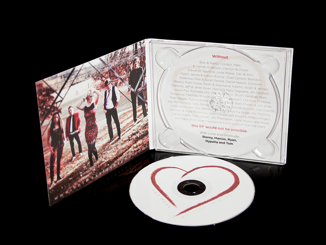
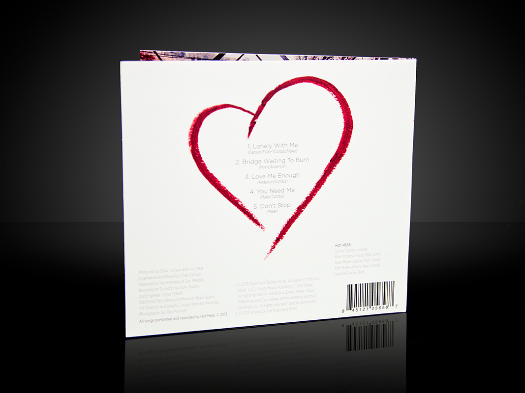
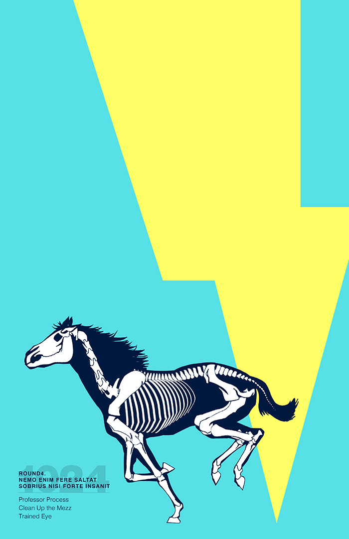
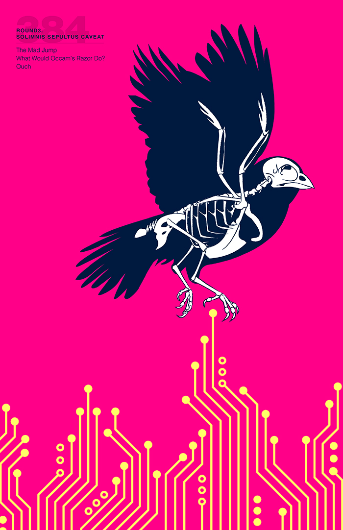
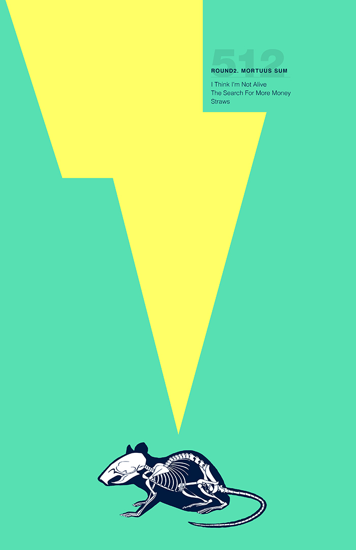
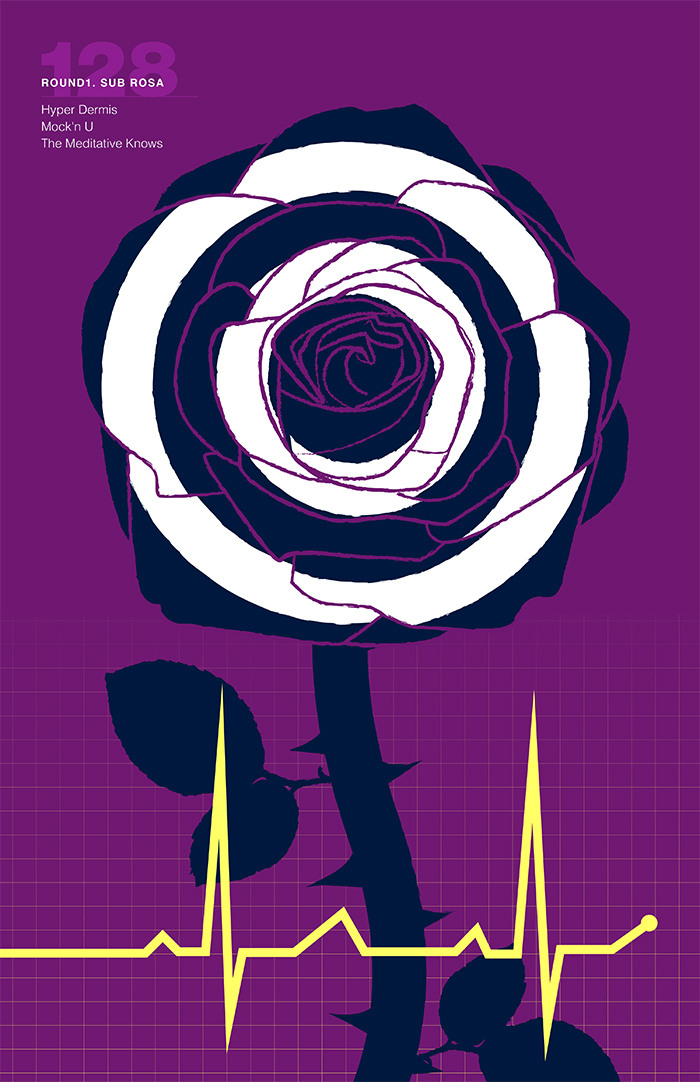
Hot Mess: Learn to Sleep With the Light On

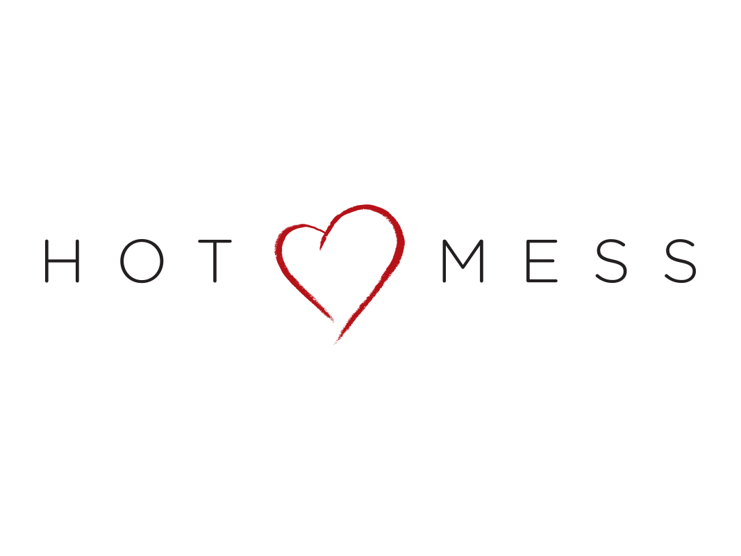
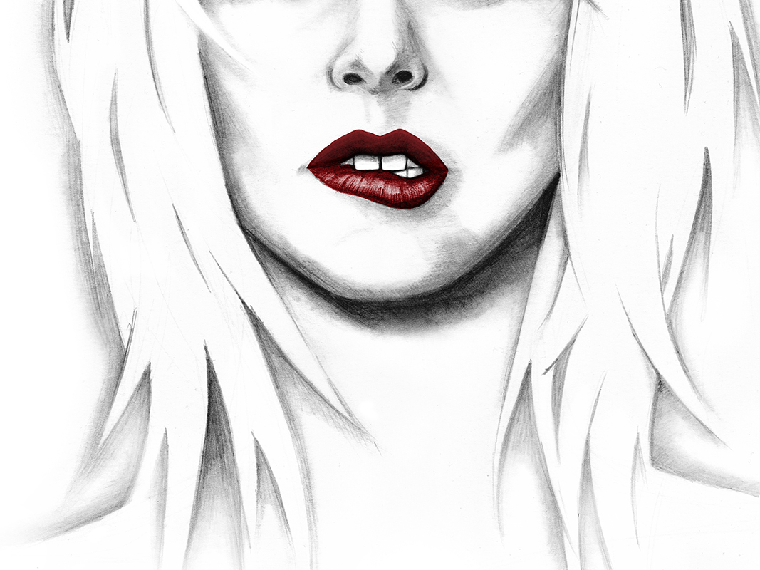
Indie-Pop band Hot Mess approached me for logo concepts as they were putting together their debut album. The band name alone leant itself to the style of the project, and the members gave me key words for the direction they wanted their image to go. Terms like sexy, trendy, retro, dark, pop, edgy, glamorous, old-Hollywood, film noir and flashy were thrown around in the ideation process. 

Team Shark Week: Today, I Am Robot

In 2008, I volunteered to make some flyers for Team Shark Week because I enjoyed their music. That flyer work lead to friendship and being hired by them to create album art and design one full length album and one EP before the band dissolved in 2015.

Doc Prop Self-Titled Album

When Nick Minniti, aka Doc Prop, came to me with this project, he had already published several albums and was looking to establish himself as an artist and define who he is musically. Before we were able to approach the packaging design, we had to establish some branding & identity for Doc Prop. I collaborated with Nick to get a feel for what he wanted and how he wanted to represent it. He was looking for something sleek, slightly futuristic and atypical to hip-hop artists. The solution was a simple wordmark with the “DP” initials creating an asymmetrical shape for the logomark. We then did photoshoots in Chico and Sacramento CA before developing the album packaging. Most of the overall layout was influenced by the curved lines of the DP initials and wordmark.

Hot Mess: Waiting to Burn

Hot Mess wanted to work with me again on their 2013 EP, Waiting to Burn. After a very successful Kickstarter campaign, Hot Mess was able to work with Grammy-winning producer Chad Carlson. The new logo and packaging reflected the refined, clean, and professional sound that Hot Mess was evolving into. I worked closely with the band to establish the visuals in illustrated form. 

Doc Prop: Personal Business

After a great experience working together on his previous album, Doc Prop approached me for his 2013 release, Personal Business. While the packaging for this one would only be a 2 panel sleeve, we still wanted to create a clean and polished look. With clean and professional photos from Tony Snow, I was able to achieve the desired look. I also evolved Doc Props logo a little bit to compliment the photography. I also created an Electronic Press Kit for Doc Prop based on the creative direction of the album packaging.